Instructional designer Brian Duck joins Tim to discuss two topics:
- Why are designers of all types still having to persuade some companies that we need access to end users on our projects in 2021?
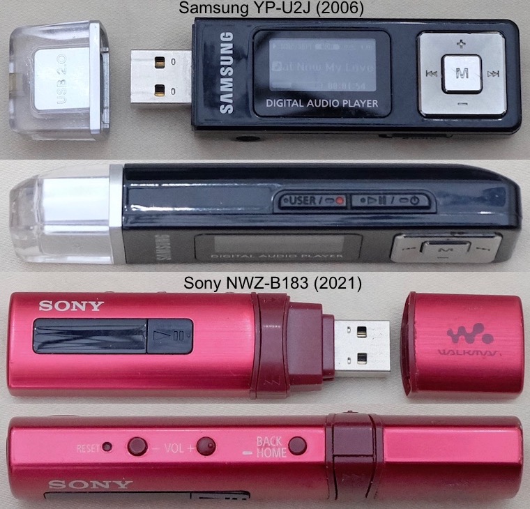
- Why is Sony’s ultra portable digital audio player UX so bad compared with Samsung’s player from 15 years ago. Doesn’t anyone benchmark anymore?
00:00 – 08:00 We commiserate on the need in 2021, in some companies, to explain the fundamental need for early access to the end users of our projects rather than accept what managers dictate as “What the users need”. Too many places still think requirements can be determined without proper stakeholder involvement.
08:00-40:00 We discuss the lack of progress in portable digital audio player UX by contrasting the superior UX of Samsung’s 15-year old YP-U2J design with Sony’s recent NWZ-B183 design that Tim is disappointed by. Brian tries each player for the first time to provide “newbie eyes” in this informal discussion (this is not a usability test, just a quick gut check with Brian on these to players’ designs). We discuss the importance of benchmarking a product category’s UX among competing products before starting a project, and ensuring that those benchmarks are met or exceeded. We don’t have any inside knowledge at Samsung or Sony about these two projects, but the glaring UX mistakes in the Sony are difficult to understand in 2021.
Our summary of UX advice for the portable digital audio player design space is what Samsung did right in 2006:
* Employ high contrast for easy reading in dim light and for users who have difficulty with fine print both on screen and on the body of the player.
* Employ large enough text for the same reasons both on the player and in the screen.
* Provide an asymmetrical cap shape and make sure it fits tightly to protect the USB port from being damaged.
* Provide an asymmetrical shape of the player itself to make it easy for users to operate by feel without eyes on. This includes the headphone jack location for players that are not solely bluetooth.
* Provide large enough and easily recognized hard buttons for basic function like Play, Next, Back, FF, REV.
* Ensure the firmware operates the hard buttons consistently as on the Samsung–the Sony unit changes the direction of the Next and Back buttons based on which menu screen a user is navigating, infuriating!
Here’s a positive review of the Sony DAP that contrasts with Tim’s disappointment.
Here’s a very quick YouTube video of a delighted Samsung customer whose YP-U2J still works great after 15 years. Build quality matters as well as UX!
Listen Now